Discover the strengths, weaknesses, and real-world applications of Microsoft's two data visualization powerhouses
As a data professional who's spent countless hours wrestling with spreadsheets and crafting compelling visualizations, I recently embarked on a journey to answer the age-old question:
Should I build my dashboard in Power BI or Excel?
After creating identical dashboards in both platforms, analyzing the same dataset, and experiencing the unique quirks of each tool, I'm here to share my findings. Spoiler alert: the answer isn't as straightforward as you might think.
The Challenge: Four Goals, Two Platforms
For this comparison, I set out to answer four critical business questions using both Power BI and Excel:
- What is the profit contribution for each sub-category?
- How do Hardware and Software revenues compare over time?
- What's the relationship between sales quantity and price across sub-categories?
- What is the total revenue within each category and sub-category?
Let me walk you through how each platform handled these challenges.
Round 1: Power BI Dashboard
The Power BI Approach: Drag, Drop, Done
Creating visualizations in Power BI felt like having a conversation with my data. Here's how each visualization performed:
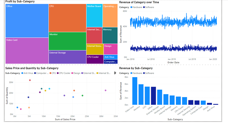
Profit Distribution (Treemap) The treemap visualization was a revelation for showing profit contribution. Unlike cluttered pie charts, the space-efficient rectangular design made it instantly clear that Office products dominated profit generation, with Video Cards as a strong second. The visual hierarchy created by different-sized rectangles told the story at a glance – no squinting at tiny pie slices required.
Revenue Trends Over Time (Line Chart) Tracking Hardware vs Software revenue trends became effortless with overlapping lines. The continuous visualization revealed that Hardware consistently generated 40-60M in revenue while Software maintained a stable 10-15M range from 2018 to 2020. The pattern recognition was immediate and actionable.
Price vs Quantity Analysis (Scatter Plot) This is where Power BI truly shined. The scatter plot revealed market positioning strategies across sub-categories, showing which products commanded premium pricing with lower volumes versus high-volume, lower-priced items. Each colored dot told a unique story about product positioning.
Revenue Comparison (Bar Chart) The descending bar chart made revenue hierarchy crystal clear – Video Cards leading at 8 billion, followed by Monitors and CPUs, with color-coding distinguishing Hardware from Software products.
Round 2: Excel Dashboard
The Excel Approach: Manual but Mighty
Excel required a more hands-on approach, but delivered solid results:
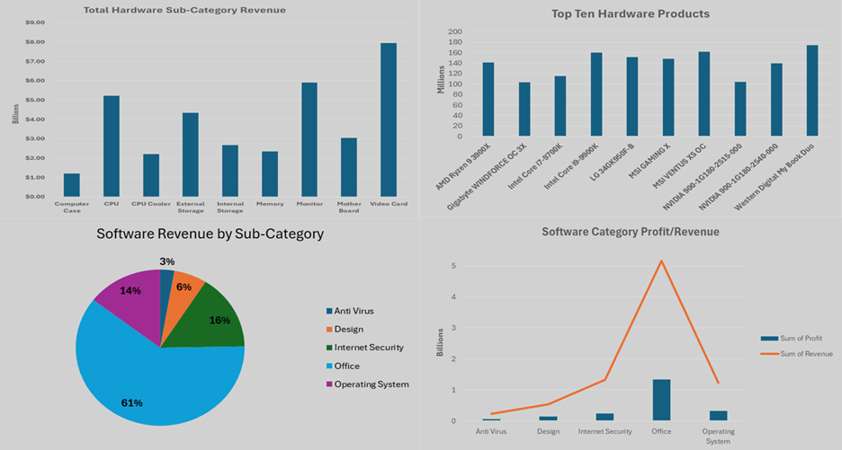
Hardware Sales Analysis (Column Chart) A straightforward vertical bar chart clearly identified Video Cards as the revenue leader among hardware sub-categories. The familiar Excel interface made customization intuitive, though it required more manual formatting.
Top Hardware Products (Horizontal Bar Chart) The horizontal layout worked perfectly for displaying product names alongside revenue figures. The "Western Digital MyBook Duo" emerged as the top performer, with the remaining top ten clearly visible.
Software Category Distribution (Pie Chart) With only five software sub-categories, the pie chart was ideal. Office software dominated with 61% of revenue, and the percentage labels made the distribution immediately understandable.
Profit vs Revenue Relationship (Combination Chart) The line-and-column combination chart effectively showed both metrics simultaneously. Office software demonstrated the strongest performance in both profit (~1.4B) and revenue (~5B), while revealing interesting margin relationships across categories.
The Verdict: Power BI vs Excel Head-to-Head
Power BI Wins: Ease and Efficiency
Advantages:
- Intuitive drag-and-drop interface – No complex formulas required
- Automatic data modeling – Relationships handled seamlessly
- Built-in interactivity – Filters and drill-through capabilities without programming
- Consistent formatting – Apply styling across all visualizations simultaneously
- Real-time updates – Data changes reflect automatically
The Experience: Creating dashboards in Power BI felt natural and fluid. It's purpose-built for this exact task.
Excel Holds Its Ground: Familiarity and Control
Advantages:
- Universal accessibility – Nearly everyone knows Excel
- Granular control – Fine-tune every aspect of your visualization
- No additional licensing – Often already available in organizations
- Familiar interface – Reduces learning curve for team members
The Challenge: Each chart requires individual attention – manual data selection, positioning, and formatting. It's like cooking from scratch versus using a meal kit.
When to Choose Which Tool
Choose Power BI when:
- Building complex, interactive dashboards
- Working with multiple data sources
- Need real-time data updates
- Collaborating with stakeholders who need drill-down capabilities
- Have budget for dedicated BI tools
Choose Excel when:
- Creating simple, static reports
- Working with smaller datasets
- Team prefers familiar interfaces
- Budget constraints exist
- Need extensive data manipulation alongside visualization
Making Excel Better: My Wishlist
Having worked extensively with both tools, here's how Excel could bridge the gap:
- Dedicated dashboard mode with drag-and-drop functionality
- Automatic layout management tools
- Pre-built dashboard templates for common scenarios
- Built-in interactivity features without VBA requirements
- Streamlined data refresh processes
- Better cross-chart formatting consistency tools
The Real-World Impact
This comparison taught me that tool selection should align with your specific needs:
- For quick analysis and familiar workflows: Excel remains unbeatable
- For sophisticated, interactive dashboards: Power BI is the clear winner
- For organizations transitioning to advanced analytics: Consider starting with Excel and graduating to Power BI
Final Thoughts: It's Not About the Tool, It's About the Story
Both Power BI and Excel successfully answered my four business questions, but they did so in fundamentally different ways. Power BI made the process feel effortless and modern, while Excel provided familiarity and control.
The best visualization tool is the one that helps you tell your data's story most effectively to your specific audience. Whether that's through Power BI's polished interactivity or Excel's trusted simplicity, the goal remains the same: turning data into actionable insights.